Data visualization (Introduction to statistics)
First we need to load the R libraries. If you get an error when running the codes below, it might mean that you don’t have the packages downloades, so you should run the commented lines below.
#install.packages('ggplot2')
#install.packages('dplyr')
library(ggplot2)
library(dplyr)
Now we define the dataset.
data = data.frame(Type = as.character(c(1, 1, 1, 1, 1, 1,
                                        1, 1, 1, 2, 2, 2,
                                        2, 2, 2, 2, 2, 2,
                                        3, 3, 3, 3, 3, 3, 3, 3, 3)),
                  factory = c('A', 'A', 'A', 'B', 'B', 'B',
                              'C', 'C', 'C', 'A', 'A', 'A',
                              'B', 'B', 'B', 'C', 'C', 'C',
                              'A', 'A','A', 'B', 'B', 'B', 'C', 'C', 'C'),
                  strength = c(14, 15, 16, 16, 12, 17,
                               17, 15, 13, 15, 17, 19,
                               20, 21, 22, 19, 22, 25,
                               26, 25, 24, 25, 27, 29, 22, 23, 24))
Now we make use of a very handy function from dplyr, called summarize.
summarizing <-
  plyr::ddply(data, c("Type", "factory"), summarise, #here I define what variables I want to stack together
                              N    = length(strength), #gettint the N for each sample
                              mean = mean(strength, na.rm = TRUE), #getting the mean
                              sd   = sd(strength, na.rm = TRUE), #getting the standar deviation
                              se   = sd / sqrt(N)) #getting the standard error
Now let us take a look at what dplyr returns. It is kinda like the pivot table function from excel (wich I don’t use anymore because R, or pandas, in Python is much cooler lol).
head(summarizing)
##   Type factory N mean       sd        se
## 1    1       A 3   15 1.000000 0.5773503
## 2    1       B 3   15 2.645751 1.5275252
## 3    1       C 3   15 2.000000 1.1547005
## 4    2       A 3   17 2.000000 1.1547005
## 5    2       B 3   21 1.000000 0.5773503
## 6    2       C 3   22 3.000000 1.7320508
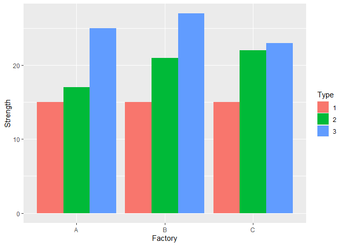
Now let us visualize. Here I plot a somewhat out of date kind of visualization. Recend papers tend to plot something which allows us to get a good idea of the distribution behind our dataset, so take a look at what violine plots, boxplots, scatterplots, and densityplot can do for you.
Well, here we use te ggplot2 library.
ggplot(summarizing, aes(x = factory, y = mean, fill = Type))+
  geom_bar(stat = "identity", position="dodge")+
  ylab('Strength')+
  xlab('Factory')

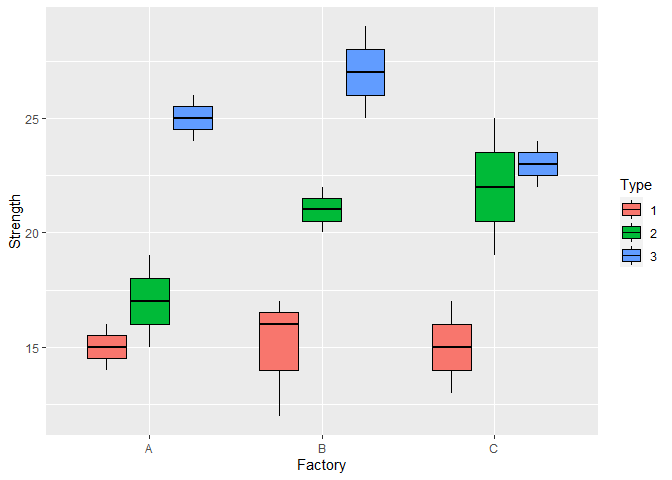
I particularly like visualizing boxplots, since they allow us to have an idea about the distribution, as well as a measure of central tendency.
ggplot(data, aes(x = factory, y = strength, colour = Type, fill = Type))+
  geom_boxplot(colour = 'black')+
  ylab('Strength')+
  xlab('Factory')

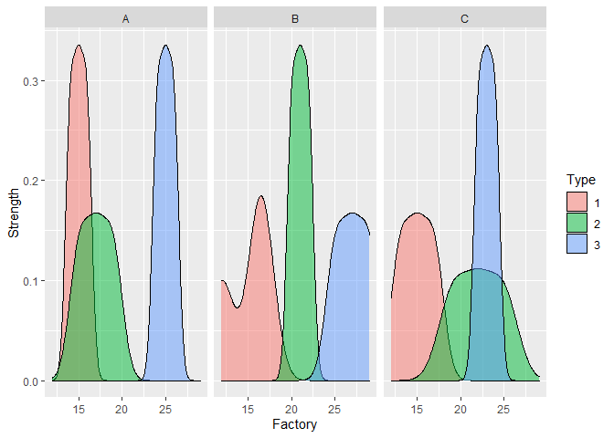
A somewhat weird density plot, which shows the distribution for each facotry and glass type.
ggplot(data, aes(x = strength, fill = Type))+
  facet_wrap(~factory)+
  geom_density(alpha = 0.5)+
  ylab('Strength')+
  xlab('Factory')

The possibilities are infinite, and the only risk of learning to use ggplot is spending way too much time there, when you should be doing something else lol :D